Why Most First Shirts Fail Before They’re Ever Printed
The failure usually happens at the file stage, not the press.
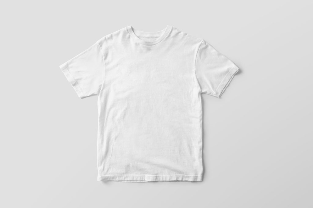
By the time a shirt comes off the press, most of the decisions that determine whether it sells have already been made, in the file, weeks earlier, by someone staring at a screen who had no way of seeing the finished object yet. Three mistakes account for the overwhelming majority of designs that never find a buyer, and none of them have anything to do with talent. They’re all about designing for the object the piece will actually become, rather than the file it starts as.
Mistake one: resolution
A design built for a phone screen or a social media post is rarely built at print resolution, because it doesn’t need to be, a phone screen shows everything at a fraction of print size, and flaws that would be obvious on fabric simply don’t show up there. What looks crisp at 72 DPI on a laptop can look soft, blurry, or visibly pixelated once it’s scaled up to a twelve-inch print. The fix is simple in principle and easy to forget in practice: work at print resolution from the very start of the file, not as a last-minute export step before you upload it.
Mistake two: legibility at a distance
Most people will encounter your design from six feet away, not six inches, across a room, across a table, glancing at someone walking past. Step back from your screen, literally, and check whether the composition still reads at that distance. If the idea only survives up close, under focused attention, it won’t survive the way it’s actually going to be seen in the world.
This is worth testing early, before you’ve invested hours into fine detail that will simply vanish at a glance. A rough thumbnail-sized version of your file, viewed from across the room, tells you more about real-world legibility than any amount of zoomed-in polishing.
If the idea only survives up close, it won’t survive across a room.
Mistake three: trying to say too much
A design that’s explaining three ideas at once usually communicates none of them clearly. It’s a natural instinct, you have more to say, so you say more, but a crowded composition asks the viewer to do the work of sorting out what actually matters, and most people won’t bother. The strongest shirts tend to carry a single, sharp idea: a phrase, a mark, an image, executed with real confidence, rather than a busy composition trying to cover every angle at once.
If you’re not sure whether a design is trying to do too much, ask what happens if you remove the second-most-important element. Often the piece gets stronger, not weaker, because the one idea that’s left finally has room to actually land.