Start With the Design Area, Not the Canvas
The design area on a shirt is smaller and stranger than a blank canvas. Design for it first.
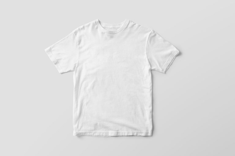
A blank canvas is generous. It lets a composition breathe in every direction, with no fixed edges pulling your eye anywhere in particular. A t-shirt’s print area is not generous. It’s a fixed rectangle sitting on a curved, moving surface, usually centered a few inches below the collar, and it comes with rules a canvas never had to answer to, a seam on either side, a fold at the chest, a body that isn’t standing perfectly still under gallery lighting. Most first designs fail before they’re ever printed, and the failure usually happens at exactly this point: they were composed for the canvas, and only afterward squeezed into the print area, instead of the other way around.
Design inside the shape, not around it
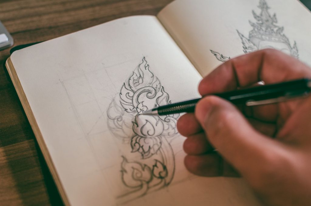
Before you open a design file, look at the actual dimensions of the print area you’re working with, not a rough guess, the real width and height in pixels. Sketch inside that shape from the first draft, not as a final cropping step. Notice where the seams, the collar, and the natural fold of fabric sit relative to your composition. A detail that reads clearly in a flat mockup, sitting on a screen with even light and no wrinkles, can disappear entirely into a fold once the shirt is actually worn.
This is the part most design software won’t warn you about. A canvas in Illustrator or Procreate has no opinion about garments. It will happily let you build a composition that only works as a flat rectangle, and it will look finished right up until you see it printed on an actual body.
Contrast behaves differently on fabric
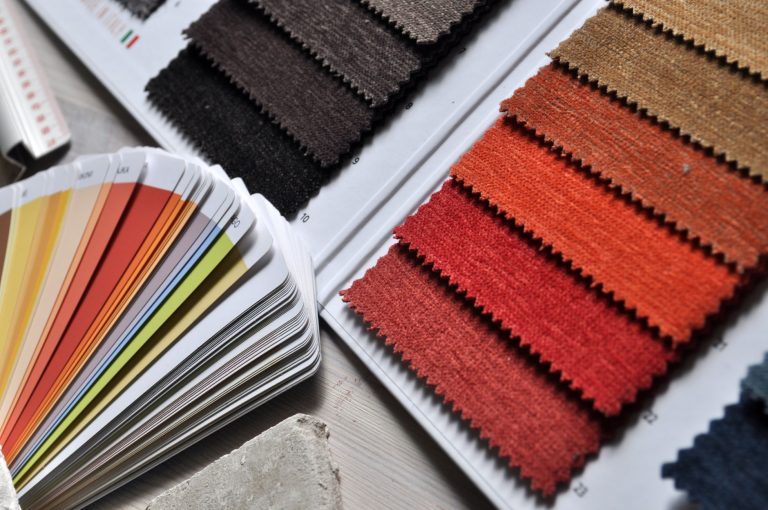
Contrast matters more on fabric than it does on a screen, and it fails in a specific, predictable way. Screens are backlit, every color you look at is being actively projected at you. Fabric isn’t. It reflects whatever light happens to be in the room, unevenly, and a palette that looks vibrant and confident on a monitor can go flat and muddy against cotton, especially anything sitting in the mid-tones. Before you commit to a run, test your darkest and lightest values against the actual garment color, not just against each other on a white digital background.
Design for the object the piece will become, not the file it starts as.
Leave room for the design to breathe
Finally, resist the instinct to fill the whole print area just because the space is there. A few things worth checking before you finalize a file:
- Does the composition still read clearly from six feet away, not six inches?
- Is there at least one area of real negative space, not just gaps between elements?
- Would the piece still make sense if someone only glanced at it for a second?
Negative space is what lets a design read at a glance across a room, which, on a wall or a wearer, is most of the time anyone will ever actually spend looking at it. A composition that needs close, sustained attention to make sense is fighting the very format it was made for.