
Printing & Production
Screen Printing vs. DTG: What Actually Changes for You
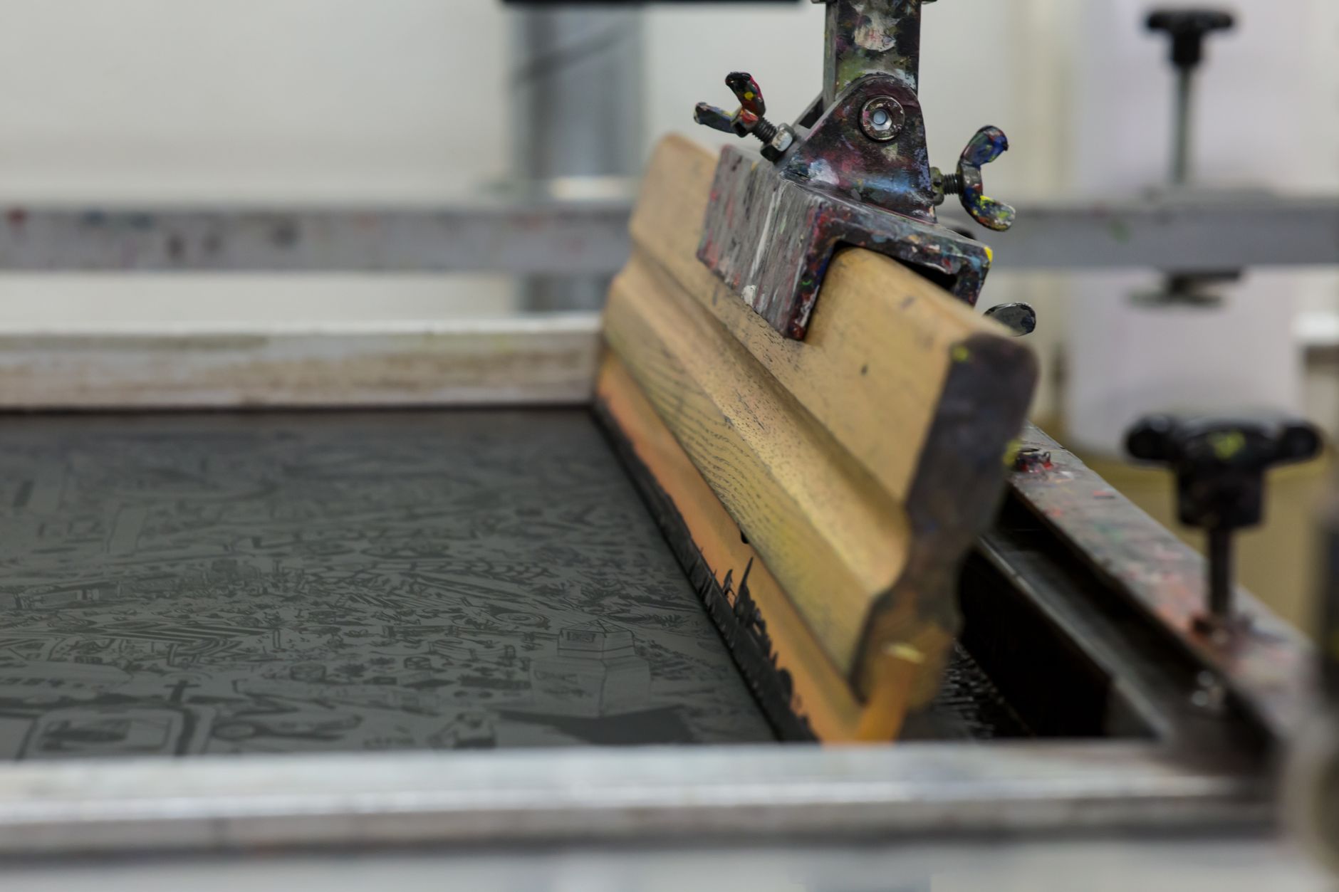
In short: Screen printing pushes ink through a stencil, one screen per color, so it rewards bold, flat designs and larger runs. DTG prints straight from a digital file, so it suits detailed, full-color artwork and small runs. Neither is better in general: the right method is the one your design was made for.
Screen printing pushes ink through a stencil. Each color gets its own physical screen, and every screen has to be prepared before the first shirt is printed. Direct-to-garment printing, usually shortened to DTG, works more like an inkjet printer. It applies ink onto the fabric straight from a digital file, with no screens at all.
Both methods end with ink on a shirt, but they get there differently. For an artist, that difference matters less as engineering than as a guide to which designs look their best on each one.
What is the difference between screen printing and DTG?
The short version is stencils versus a print head. Screen printing builds a design in layers, one color per screen, with each layer pressed through fine mesh onto the garment. DTG reads the artwork file and lays down all of its colors in a single printing process.
That one difference drives most of the others, from setup and color limits to run size and feel. The table below sets out the general characteristics side by side. Treat them as broad tendencies, since real results depend on the shop, the inks, and the garment.
| Characteristic | Screen printing | DTG |
|---|---|---|
| How ink is applied | Pushed through a mesh stencil, one color per screen | Printed directly from a digital file, like an inkjet |
| Setup before printing | A screen must be made and lined up for each color | Little physical setup; the file goes to the printer |
| Effect of color count | Each added color adds a screen and a printing step | Color count makes little difference to the process |
| Gradients and photographic detail | Possible but harder; often simplified or simulated with halftone dots | Handled naturally, since the file prints as it is |
| Run size it suits | Larger runs, where setup is spread across many shirts | Single pieces and small runs |
| Feel on fabric | A thicker ink layer that sits on top, often slightly raised | A softer feel, with ink sitting more into the fibers |
| Dark garments | Opaque inks stay bright on dark fabric | Usually needs a white base layer; colors can look less vivid |
| Designs it rewards | Bold type, solid shapes, deliberate limited palettes | Detailed illustration, soft blends, full-color artwork |
What each method rewards in a design
Screen printing: shapes and flat color
Screen printing rewards simplicity, and the reason is practical. Every color needs its own screen. A design built from a few flat color areas is simpler and faster to produce than one with many overlapping colors or gradients.
The ink sits on top of the fabric as an opaque layer. You can often feel a screen-printed design as much as see it. That thick layer is why the method is known for strong color on dark shirts and for prints that hold up well through washing.
DTG: detail and color blending
DTG has almost no color-count penalty. A full-color illustration and a simple two-color logo go through the same process, because the printer reproduces whatever the file contains. That makes DTG the natural tool for detailed illustration, soft gradients, and photographic work. Those would be impractical to screen print with a separate stencil for every shade.
The tradeoff is real. DTG prints tend to have a softer feel, sitting more into the fabric than on top of it. On darker garments, though, DTG can look less vibrant than an opaque screen-printed ink. Results vary with the printer, the pretreatment, and the fabric itself.
Is DTG or screen printing better for small runs?
For single pieces and small runs, DTG is generally the more practical method. Screen printing carries a fixed setup cost in time and materials. Screens have to be made, mounted, and lined up before anything is printed. Spread across hundreds of shirts, that setup is a small share of each one. Spread across five shirts, it is most of the work.
DTG has very little setup, so printing one shirt is not much different from printing the tenth. Screen printing grows more efficient as a run grows, which is why it remains common for large orders of one design.
Run size is not the whole story, though. A bold graphic can still look its best screen printed, and a painterly piece can still look its best as DTG, whatever the quantity. Let the design be the deciding factor.
How do you choose the right method for a design?
Before you finalize a design, don’t ask which process is better. Ask a simpler, more specific question.
Is this piece defined by flat, bold shapes, or by fine detail and color blending? The answer usually tells you which process it was meant for.
A few quick signals help:
- Bold typography, solid color blocks, and high-contrast graphics point toward screen printing.
- Detailed illustration, photographic elements, and soft gradients point toward DTG.
- If you can’t tell which group a design belongs to, that is often a sign the design itself could be simplified.
Whichever way a design leans, a few checks apply to both methods. Make sure the artwork sits well inside the printable area, which is covered in start with the design area, not the canvas. Judge your colors on fabric rather than on a backlit screen, as explained in color choices that survive fabric. And look at the file at actual print size before you commit. Many of the problems in why most first shirts fail are visible at that stage.
Answering these questions honestly, before you submit a file, saves you from finding out the hard way after the run is already open.
Frequently asked questions
Which lasts longer, screen printing or DTG?
Screen printing is widely known for durability because of its thick, opaque ink layer. DTG durability depends more on the printer, the pretreatment, the curing, and the garment. For either method, washing inside out in cold water and avoiding high dryer heat helps a print last.
Can DTG print well on dark shirts?
Yes. On dark garments, DTG usually lays down a white base layer first so the colors show. Bright colors can look a little less vivid than opaque screen-printed ink, so check high-contrast designs on a dark mockup before you commit.
Does the number of colors in my design matter?
It matters a lot for screen printing, where each color needs its own screen and printing step. It matters very little for DTG, which prints the full file in one process.
Is one method better for artists selling their own designs?
Neither is better in general. Match the method to the design, using the signals above. If you’re thinking about selling your work as numbered editions, see how to become a HollaJack artist.