
Design & Craft
Color Choices That Survive Fabric, Not Just Screens
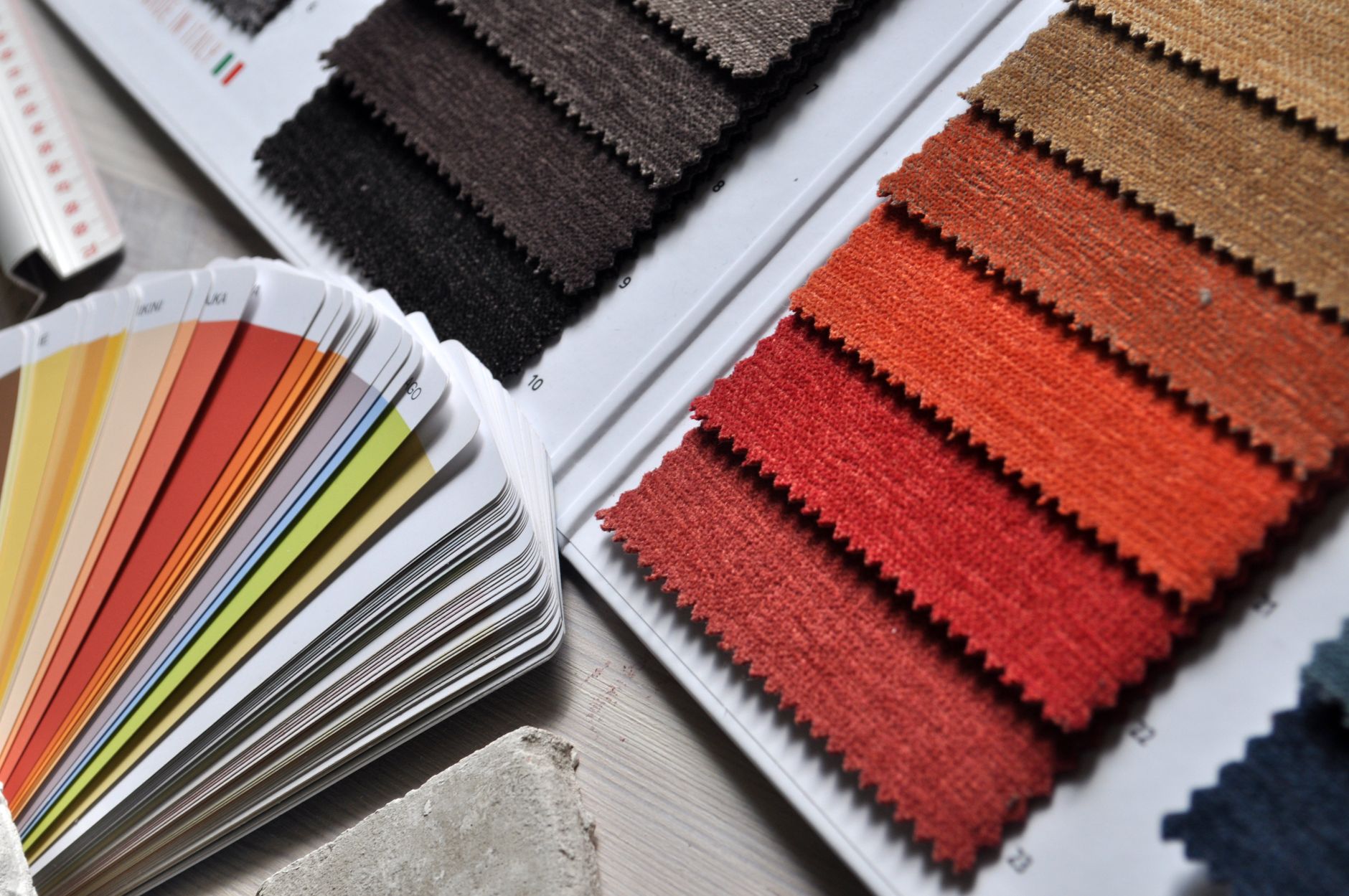
Screens produce color with light. Fabric produces color by reflecting it, and it reflects unevenly, cotton absorbs ink differently than a synthetic blend, and the color of the garment itself will always shift the appearance of anything printed on top of it. A palette chosen entirely on-screen is, in a very real sense, a guess about how it will behave once it’s actually printed. It might be a good guess. It’s still a guess.
Start with the garment, not the artwork
If you’re printing on black or navy, colors that look punchy and saturated on a white digital canvas can go flat or muddy once they’re surrounded by dark fabric instead of white space, the eye reads color relative to what’s around it, and a dark garment changes that context entirely. Light garments are more forgiving in this specific way, but they introduce a different problem: very light or pastel inks can wash out against a pale background and lose their definition almost completely.
The practical version of this: before you finalize a palette, mock the design up against the actual garment color you intend to print on, not a neutral white background. It takes a few extra minutes and catches problems no amount of on-screen color theory will.
Fewer colors, chosen on purpose
Limit your palette deliberately rather than by accident. Every additional color in a design adds cost, adds printing complexity, and adds one more place where a mismatch between screen and fabric can quietly show up without you noticing until the proof arrives.
- Two or three well-chosen, high-contrast colors will usually outperform a five-color gradient that only works inside the file.
- Every color you add should be doing a specific job, if you can’t say what it’s for, it’s probably not earning its place.
- High contrast against the garment matters more than how the palette looks in isolation.
A five-minute look at ink on real fabric tells you more than an hour spent adjusting values on a monitor.
Get a physical proof before you commit
If you can, get an actual physical proof before committing to a full run, not a digital mockup, an actual printed sample under real light. Screens and fabric are two genuinely different mediums for the same colors, and the gap between them is exactly where most avoidable color mistakes live. A short delay to check a proof is almost always cheaper than discovering the problem after a run has already opened.